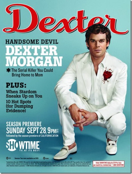
For those of you who don’t know already, Dexter is a highly controversial, Emmy award-winning TV series with a serial killer as its protagonist. The acclaimed series is broadcast by Showtime, a subscription based cable channel owned by CBS Corporation.
 To promote the third season of the series, the channel unleashed a series of print ads, which, interestingly enough, resembled the covers of the popular magazines in which they ran. All the ads portray the boyishly handsome actor Michael C. Hall dressed to kill (ha, ha) in his Dexter Morgan avatar.
The Font Feed blog did a very entertaining and thorough analysis of the various typographic elements in the ads.
Snip from the article:
The mock magazine covers are incredibly well crafted and look very convincing. Faithfully recreating the magazine logos and finding the correct typefaces for the cover titles must have been a difficult task, yet most of the covers make you look twice before you realize that the logo actually spells out “Dexter” instead of the magazine’s original name. They are a real treat to discover and very funny, especially with the “slasher” references in the titles and some of the cover images.
Link to the article.


